And That’s Exactly Why Its Website Works. What if the best marketing message isn’t clever… but obvious?
We’ve all done this before.
We land on a website. The design looks beautiful. The colors are perfect. The animation is smooth.
But after 10 seconds, we’re still asking one simple question:
“Wait… what exactly do they do?”
And when that question appears, something inside our brain quietly switches off.
Because confusion kills curiosity.
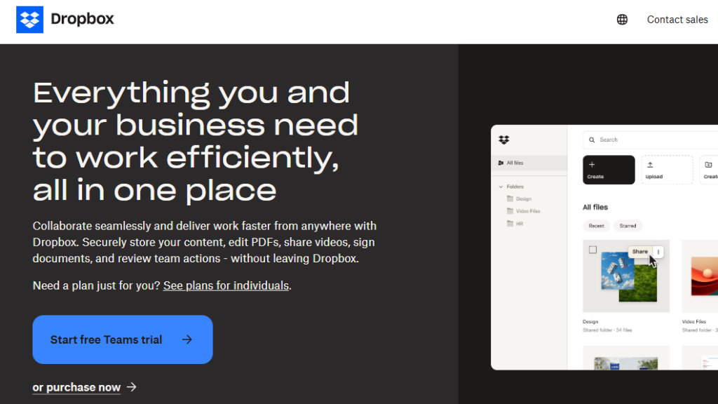
Interestingly, the opposite happens when we land on the website of Dropbox.
Within seconds, we know what it does.
Not because the design screams for attention.
Not because the headline tries to sound brilliant.
But because the message is painfully clear.
And that simplicity is exactly why it works.
This isn’t a teardown. This is simply my point of view, shaped by years of watching how messaging either pulls people in… or quietly pushes them away.
The Moment That Made Me Pause
A few months ago, I was reviewing several websites.
Different industries.
Different founders.
Different design styles.
But strangely, many of them shared the same problem.
Their websites looked impressive…
yet somehow said almost nothing.
Headlines like:
“Empowering digital transformation.”
“Innovating the future of solutions.”
“Elevating your business potential.”
They sounded sophisticated.
But they also sounded like everyone else.
So I tried something simple.
I opened the homepage of Dropbox.
The message?
“Keep life organized and work moving — all in one place.”
Or sometimes even simpler:
“Store, share, and collaborate on files.”
That’s it.
No clever metaphors.
No marketing gymnastics.
Just clarity.
And it made me pause.
Because in a world where everyone tries to sound smarter, Dropbox decided to sound clearer.
The Cost of Being “Creative”
We often think marketing is about creativity.
But in reality, marketing is mostly about reducing friction.
Every unclear sentence adds friction.
Every vague phrase creates hesitation.
And hesitation is expensive.
According to a study by the Nielsen Norman Group, users typically decide whether to stay or leave a webpage within 10–20 seconds.
Even more interesting, users usually read only 20–28% of the words on a page. Which means people rarely read carefully, but they scan.
So if the message isn’t obvious immediately, most of the time we don’t lose attention gradually.
We lose it instantly.
This is where Dropbox quietly wins.
The Clarity Advantage
Let’s look at what Dropbox actually communicates.
Not the features.
Not the technology.
Just the message.
Their core value can be summarized in one sentence:
“Your files, accessible anywhere.”
Simple.
But powerful.
Because the brain loves clarity.
Cognitive scientists often talk about something called processing fluency, the easier something is to understand, the more people tend to trust it.
In other words, when a message feels effortless to process, it feels more believable.
Psychologist Daniel Kahneman once wrote:
“If something is easy to understand, we assume it is more likely to be true.”
Dropbox doesn’t force us to decode its message.
It simply tells us what it does.
And that small difference makes a huge impact.
Why Most Websites Fail This Test
Here’s something we rarely admit.
Many websites are written from the inside out.
We describe what we built.
We describe what we believe.
We describe what we think sounds impressive.
But visitors arrive with a completely different question:
“How does this help me?”
Dropbox answers that question immediately.
Not with features.
But with usefulness.
The Simplicity That Scales
Dropbox isn’t a small startup experimenting with messaging.
At its peak, the platform served over 700 million users worldwide.
And despite operating at that scale, the messaging remains remarkably simple.
There’s a reason for that.
Simple messaging travels better.
It translates across cultures.
Across languages.
Across industries.
And perhaps most importantly…
It spreads faster.
This reminds me of something often quoted by Albert Einstein:
“If you can’t explain it simply, you don’t understand it well enough.”
Great messaging works the same way.
If the value proposition requires too much explanation, something isn’t clear yet.
A Small Exercise We Can Try
Sometimes the easiest way to test a website message is with a very simple exercise.
Imagine we show our homepage to someone for five seconds.
Then we close the laptop.
Now we ask them:
“What do you think that company does?”
If the answer is close to the real thing, the message works.
If the answer is vague, confused, or completely wrong…
Something needs to be rewritten.
Dropbox would likely pass this test.
Because its message isn’t trying to impress us.
It’s trying to inform us.
And that difference is bigger than it sounds.
The Lesson I Learn
Over the years, I’ve noticed something interesting.
The harder we try to sound smart, the harder it becomes to be understood.
Marketing teams often fall into a strange trap. We spend hours polishing a headline…
But forget to ask the most basic question:
“Would someone outside our company understand this in three seconds?”
Dropbox seems to have avoided that trap.
Its messaging respects the reader’s time.
And that’s probably the most underrated quality in modern marketing.
Because attention is scarce.
According to research from Microsoft, the average human attention span in digital environments has dropped to around 8 seconds.
Whether that number is perfectly accurate or not, the direction is clear.
Attention is shrinking.
Which makes clarity even more valuable.
What We Can Borrow From This
We don’t need to build the next Dropbox to apply the same thinking.
Sometimes the change is surprisingly small.
Instead of asking,
“How do we make this sound impressive?”
We could try asking,
“How do we make this instantly understandable?”
Sometimes that means removing clever words.
Sometimes it means rewriting a headline five times.
Sometimes it means replacing a paragraph with one sentence.
It’s not glamorous work. But it’s powerful.
Because the best website messaging doesn’t force people to think harder.
It makes thinking unnecessary.
The Quiet Power of Obvious
There’s a strange bias in marketing.
We often assume that if something feels obvious, it must be weak.
But obvious is often exactly what people need. Dropbox understood that early. It didn’t try to reinvent language. It simply explained the value clearly.
And sometimes that’s the most persuasive strategy of all.
Because when a message is instantly understood, the brain can move to the next question:
“Do I want this?”
Instead of getting stuck on the first one,
“What is this?”
And that small shift makes all the difference.
One Last Thought
If there’s one thing I keep reminding myself when looking at websites, it’s this: People don’t reward clever messaging, but they reward clear messaging.
Dropbox proves that again and again.
Not by being louder, but by being simpler.
And maybe that’s the real takeaway.
In a world full of complicated marketing…
clarity is still the most underrated competitive advantage.
Many of the websites I come across don’t struggle because of bad products. They struggle because their message isn’t clear yet. Sometimes a small rewrite can change everything.
If this perspective resonates with us and we feel our website might be saying too much — while communicating too little — feel free to reach out.
I occasionally help founders rewrite and sharpen their website messaging so visitors understand the value instantly.
No jargon.
No clever tricks.
Just clarity.
Because sometimes the most powerful marketing change isn’t a redesign.
It’s a better sentence.
What do we think? Have we ever landed on a website that looked great… but left us wondering what it actually does?
I’d love to hear your experience.